Preparing your logo for pad printing
Good pad printing starts long before ink touches the product. A clean file, realistic colour plan and the right print area save time at proof stage and help small items print neatly.
Start with the right artwork file
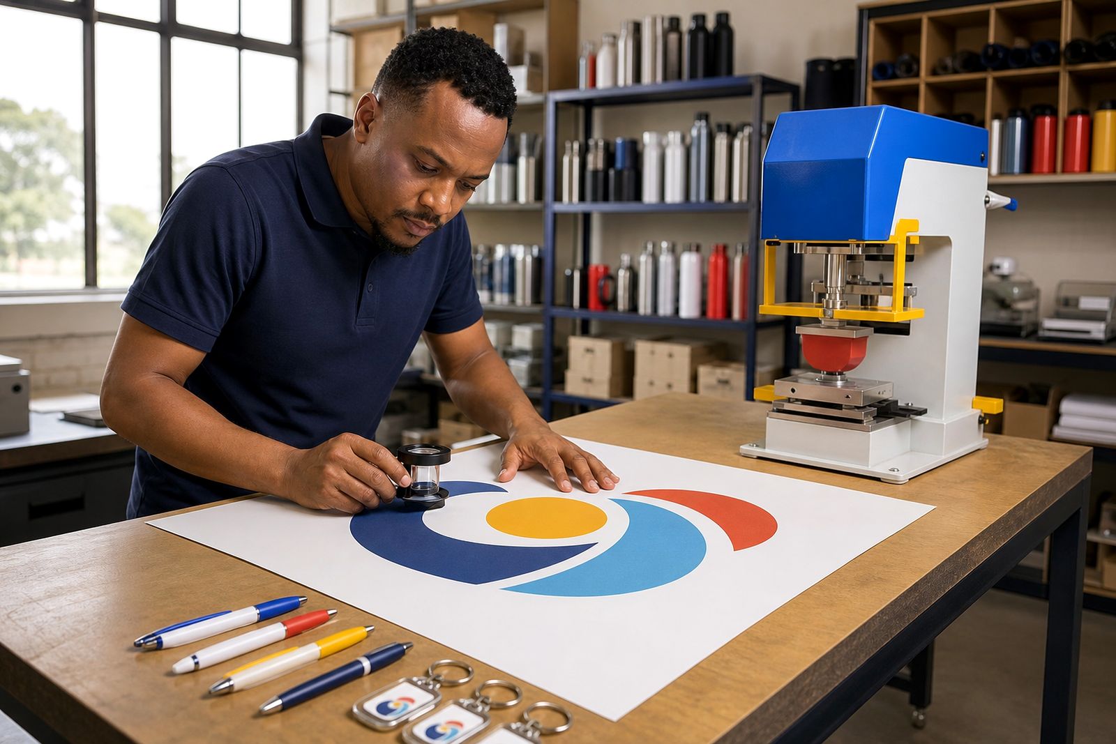
Vector artwork gives the best result for pad printing because the image stays clean when we size it for a pen barrel, a mug panel or a small tech item. Files supplied as AI, EPS or editable PDF usually work best. If you only have a PNG or JPG, we can inspect it, but low resolution artwork often causes fuzzy edges and uneven shapes once reduced to a small print area.
Text should be converted to outlines before sending, and linked images should be embedded where possible. That avoids missing fonts and substituted elements when the file is opened for plate work. A tidy file with one final logo version is easier to proof, easier to separate by colour and less likely to produce a last minute hitch.
- Send vector files first where available.
- Outline all fonts before export.
- Remove unused logo options from the page.
- Keep the logo at full quality, not pasted from a screenshot.
- Include a PDF reference if the artwork has special positioning notes.
Keep line weights and small detail realistic
Pad printing can reproduce fine detail, but every product has a limit. Very thin lines, tiny reversed text and delicate gaps may close up or break when printed onto curved or textured surfaces. A golf ball, keyring or USB drive offers far less room than a notebook cover, so the same logo cannot always be used unchanged across every item.
As a general guide, thin strokes should not rely on hairline settings, and small text needs enough body to remain legible after ink transfer. If your logo contains a crest, seal or dense icon, we may recommend a simplified version for smaller products. That is not a downgrade. It is usually the cleanest way to protect your branding on compact items where every millimetre matters a bit more than most people expect.
- Avoid extra-fine rules around badges or circles.
- Reduce tiny legal lines on small merchandise.
- Use solid fills with enough separation between shapes.
- Prepare a simplified mark for very small print areas.
Plan colours for the item, not only the logo sheet
Logo colours on screen do not always translate directly to pad printing inks. The colour of the product itself affects how the print reads, especially on dark bottles, coloured pens and translucent plastic items. A white underbase may be needed in some cases, while in others a direct spot colour is enough. For multi-colour logos, each colour is prepared separately, so clean separation matters from the start.
If your brand has exact colour references, send them with the artwork. Pantone references are useful where available, but if you do not have them, provide a clear visual sample or an approved brand guide. Metallic effects, gradients and photographic fades often need adaptation for pad printing because the process suits solid graphic shapes better than soft tonal transitions. It sounds strict, but this is where a good proof saves dissapointment later.
- Supply named spot colours where possible.
- Flag any colours that are critical to brand recognition.
- Expect dark products to affect lighter inks.
- Replace gradients with solid colour steps where needed.
- Separate each print colour cleanly in the file.
Measure the print area before setting the layout
The available branding space on promotional items is often smaller than expected. A mug may have a generous side panel, while a pen clip area or keyring face allows only a narrow strip. Before approving artwork, we check the usable print area on the chosen item and adjust the logo size and placement to suit that surface. On curved products, a shape that looks balanced on a flat page can feel cramped once wrapped onto the item.
It helps if your file does not assume one universal size for every product in the order. The same event identity might need one version for drinkware, another for stationery and a compact mark for tech gifts. Where space is very tight we may suggest dropping a tagline, web address or secondary line. Trying to force all elements in usually leaves the print looking busy and smaller than it should be.
- Ask for the printable area of each item type.
- Keep a compact logo lockup ready for narrow spaces.
- Remove taglines when the area is too limited.
- Leave some breathing room around the artwork edge.
Prepare files for one-colour and multi-colour printing
One-colour artwork is usually the most straightforward to set up, but it still needs proper contrast and clean edges. Multi-colour work needs more planning because each colour must register accurately against the next. Small movement can matter on a USB drive logo or a fine ring around a sports gift, so overlapping edges and very tight traps should be checked early.
Where a logo uses several colours, send the artwork in layers or clearly separated elements. If there is a preferred print order, note that in the file or when you submit the job. White backing, keylines and tiny knockout details should also be identified. These practical notes make a big difference at proof stage and reduce avoidable corrections before the plate is made.
- Keep each colour on its own layer where possible.
- Label the final approved colour version clearly.
- Show any white backing as a separate element.
- Flag tight registration points for review.
What to send with your logo
A strong artwork pack includes more than the logo file on its own. We need to know which item will be branded, where the logo should sit and whether there are colour priorities if space becomes tight. If the item is being used for a conference, school pack or year-end gift, that context also helps because different events call for different levels of detail and visibility.
When you are ready, send the artwork files and notes through our contact form so the job can be checked against the selected items. If something in the file needs attention we will raise it before printing, not after the cartons are packed. A little prep at this stage usually makes the sample look cleaner and the final run more consistent.
- Final logo file in vector format if available.
- A PDF or image showing the intended look.
- The product type and preferred print position.
- Any brand colour references or guidelines.
- Notes on simplified versions approved for small areas.
What our Pad Printing customers say
Verified Google reviews
Questions we get asked
Can I send a JPG of our logo?
You can, but vector artwork is far better for pad printing. A JPG may work for checking layout, yet low resolution images often lose edge quality when reduced for small promotional items.
Do all items use the same logo size?
Not usually. Pens, bottles, mugs, keyrings and golf balls each have their own printable area, so the logo often needs resizing or simplifying to suit the item properly.
What if our logo has a gradient or very fine detail?
We may suggest an adapted version for pad printing. Solid colours and clearer shapes normally reproduce better on small curved products than gradients, tiny outlines or dense crest details.
Also worth a look
Tell us about the job
Send sizes, materials and where you are through our contact form, and we will come back with the practical options.
Open the contact form